What You’ll Learn
- How smart e-commerce design choices boost mobile conversions
- Why great fashion UX goes beyond good looks and focuses on ease
- What makes mobile-first fashion design essential for modern retail
Introduction
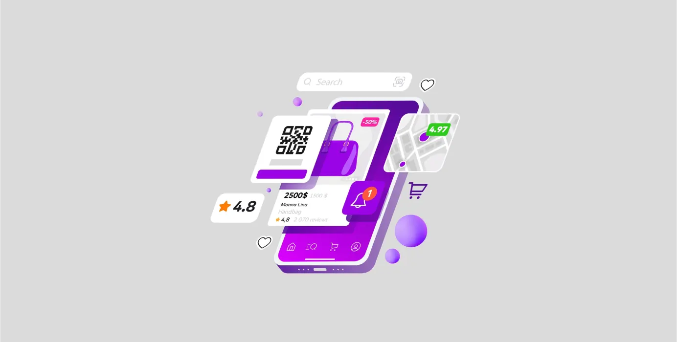
Let’s be honest: if your fashion site doesn’t feel smooth on mobile, you’re losing sales. Today’s shoppers scroll, tap, and buy in seconds and they expect that experience to be fast, stylish, and intuitive. That’s where smart mobile-first fashion design really comes into play.
From thumb-friendly layouts to subtle animations that elevate the brand feel, the latest fashion UX trends are all about making the journey seamless. And if your e-commerce design hasn’t caught up yet, it might be time for a refresh.
Here’s what’s shaping mobile fashion UX in 2025—and why it matters.
One-Hand, One-Tap Navigation
Minimal taps. Clear buttons. No guesswork.
That’s the rule now. The best mobile-first fashion design puts everything within easy reach. Menus collapse neatly. Filters are swipeable. Products load fast, without freezing mid-scroll. When done right, it’s invisible and drives conversions.
But behind the scenes, it takes thoughtful e-commerce design to get that simplicity right. Especially in fashion UX, where the visuals matter as much as the function.
Smarter Visual Hierarchy
Mobile screens are tiny. So what deserves attention?
Trend-savvy fashion UX teams are getting sharper about this. Think: bold product imagery, clean price tags, and scroll-stopping typography. Everything guides the shopper’s eye without overwhelming them.
In e-commerce design, this kind of visual clarity helps users make faster choices because they aren’t second-guessing where to look. It’s less about flash, more about flow.
Swipe-First Product Discovery
People don’t browse the way they used to. Instead of digging through menus, they swipe—left, right, up, repeat.
That’s why some brands are now designing mobile catalogs with Tinder-style gestures. This playful, friction-free approach is one of the more experimental (but effective) trends in mobile-first fashion design.
It feels fresh. It keeps people engaged. And when paired with great fashion UX, it turns casual scrolling into serious conversions.
Micro interactions That Make a Difference
That tiny heart animation when someone favorites a product? That’s a micro interaction —and they’re becoming staples of modern e-commerce design.
Done subtly, they build delight and encourage users to engage. It’s especially valuable in fashion UX, where emotion drives purchases. Micro interactions aren’t flashy, but they help your mobile experience feel more alive.
Checkout Without the Chore
We’ve all been there: You want the thing, but the cart page asks for everything but your blood type.
Smart mobile-first fashion design cuts out that mess. Autofill, guest checkout, saved preferences—it’s all becoming standard. And it should be. A clunky payment process breaks trust and drops conversions.
Good e-commerce design gets out of the way. Especially when it’s backed by solid fashion UX thinking.
Conclusion
Fashion is fast, but good fashion UX doesn’t rush—it flows. With thoughtful e-commerce design and a sharp focus on mobile-first fashion design, your brand isn’t just keeping up. It’s setting the pace.
Whether you’re launching something new or fine-tuning an old site, the right mobile approach will do more than just look good. It’ll help your users feel good while clicking “buy now.”
 Previous