What You’ll Learn
- How mobile UX impacts customer engagement and sales on retail websites
- Key design principles to make your mobile-friendly retail website intuitive and fast
- Common mistakes to avoid when building or updating retail websites for mobile
Introduction
Today’s shoppers are scrolling before they’re strolling. Mobile usage now dominates online browsing, especially for e-commerce. So if your retail brand still isn’t optimized for smaller screens, you’re likely losing customers without even realizing it. If you’re managing or designing retail websites, then this blog is for you.
We’re diving into practical, non-fluffy tips to make your mobile-friendly retail website actually work for your users and your business. Because good mobile UX isn’t just about how it looks. It’s about how it feels to use.
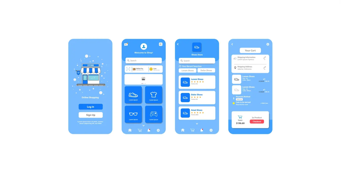
Keep Navigation Short and Sweet
Small screens demand simplicity. Your retail website should offer easy access to core sections—home, products, cart, and account—without users hunting through layers of menus. Good mobile UX keeps things focused. Think fewer clicks, faster decisions. A mobile-friendly retail website trims the excess and guides the user intuitively, not endlessly.
Design With Fingers in Mind
It’s called “mobile” for a reason.
people tap, not click. So your buttons should be large enough to tap without zooming or frustration. If shoppers can’t easily add to cart or browse a product, your mobile UX is working against you. Every element on your retail website should be designed for touch, not just display. This single detail can be an ace move for building a mobile-friendly retail website.
Speed Matters (A Lot)
Patience isn’t a strong suit for most users. If your retail website takes longer than a couple of seconds to load, people will find somewhere faster to be.
A smooth mobile UX starts with speed. Optimize your images, limit third-party scripts, and test performance often. A fast mobile-friendly retail website keeps people shopping instead of waiting.
Make Text Easy to Read
Tiny fonts or squished layouts don’t belong on mobile.
Prioritize clean typography, proper spacing, and a layout that adjusts seamlessly. When retail websites ignore readability, the experience feels clunky. Good mobile UX respects the reader’s eyes—clear content builds trust. And trust leads to more checkouts.
Simplify Checkout
Here’s where many retail websites lose momentum. If your mobile checkout feels like filling out a tax form, users will abandon it. A strong mobile UX simplifies the process.
Auto-fill options, guest checkout, and minimal steps. Make the buying process easier and people surely will be more likely to go through checkout.
Prioritize Key Actions
Your call-to-action buttons shouldn’t be shy. On retail websites, your call-to-action buttons—like “Add to Cart” or “Buy Now”—shouldn’t have to fight for attention.
If they fade into the background, users will do the same. Make them obvious, tappable, and impossible to ignore.
These actions should be impossible to miss. Clear priority in design equals smoother mobile UX and fewer second guesses.
Test Like a Shopper, Not a Developer
Sometimes, what looks great in testing falls flat in reality. Walk through your mobile-friendly retail website the way a real user would on different phones, networks, and screen sizes. This is how you fine-tune the mobile UX. Real-world testing reveals what mockups don’t.
Conclusion
Making your retail website work on mobile isn’t just a nice-to-have, it’s what your customers already expect.
It’s less about following design trends and more about making sure your site actually works when (and where) people are shopping. With a sharp eye on mobile UX and a site that feels natural to use, you’re not just impressing visitors, you’re turning them into buyers.
This blog didn’t just repeat the usual tips. It gave you a clear path to build better, shop-ready experiences that actually perform.
 Previous