What You’ll Learn:
- How UX design can boost engagement and simplify browsing on your food website
- Why intuitive website design matters for showcasing your menu, brand, and story
- Easy tweaks to improve the UX design and overall experience for your visitors
Introduction
Great food needs to be seen, clicked, and craved and it starts with a strong digital presence. If you’re running a food website, whether it’s for a restaurant, bakery, cloud kitchen, or even a personal food blog then this blog is for you.
A seamless UX design can turn hungry browsers into loyal customers, while poor website design can make even the most delicious offerings go unnoticed. So let’s break down a few easy ways to make your food website more intuitive, inviting, and yes—user-friendly.
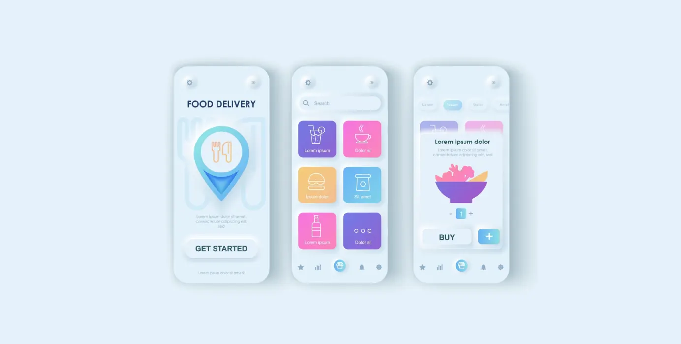
Simplify Navigation
Visitors shouldn’t feel lost. Your food website should have a clear and simple menu (the digital kind) that helps users find what they need quickly—be it the food menu, location, or online ordering. Good website design places key sections where users expect them. Keep navigation consistent and clean. It’s a basic but crucial part of strong UX design.
Use High-Quality Visuals Without Slowing It Down
People eat with their eyes first, especially online. So your food website must be visually rich but optimized.
Large, slow-loading images can absolutely ruin a user’s experience. A thoughtful website design strikes the balance: great visuals that load fast. It’s one of those subtle UX improvements that users notice even if they don’t say it aloud. Good UX design isn’t loud. It just works so smoothly you barely notice it, and that’s the point.
Make Mobile a Priority
Let’s be real: most people will visit your food website from their phones. That’s why mobile responsiveness isn’t optional. If a button’s too tiny to tap or the text needs squinting, something’s off. Everything should feel smooth like the site just gets how people use it.
This is core to modern UX design. If your website design breaks on smaller screens, users will bounce—and likely not return. Mobile-first is not a trend anymore. It’s a standard.
Streamline the Ordering or Booking Flow
Whether it’s reserving a table or ordering a late-night dessert, the process should be fast and easy. This is where smart UX design really shines. Avoid too many steps or required sign-ups. A food website that makes transactions simple builds trust and more importantly, repeat visitors. Even a great-looking website design falls short if the flow is frustrating.
Use Clear, Tempting Copy
Design gets users in, but your words keep them there. Your food website should sound like you—authentic, informative, and appetizing. Combine engaging headlines with helpful descriptions. This human layer is a big part of effective UX design content that communicates. Pair it with clean website design, and you’ve got a winning combo.
Bonus Tips
- Add reviews or testimonials—real social proof goes a long way
- Make your contact info super easy to find
- Use consistent branding (colors, logo, tone) throughout the food website
Conclusion
A food website doesn’t have to shout to stand out. Forget the glitter, what really wins people over is a site that just works. Smooth navigation, quick load times, and content that doesn’t sound like it was written by a robot. Great UX design is kind of like seasoning—you don’t always notice it, but take it away and suddenly everything feels off. This blog is a practical guide to rethinking how your website design speaks to your audience. So if your current site is looking a bit undercooked, these small shifts can make a big difference.
 Previous