What you’ll learn:
- How smart e-commerce UX practices guide buyers through your beauty website?
- Why clear structure and design matter in UX for beauty brands?
- Tips that turn scrolls into purchases using better e-commerce UX practices?
Introduction
If someone ends up on your beauty website, they’re halfway there. Maybe they need a serum that actually does something, or a foundation that finally matches. Maybe it’s a last-minute gift. But if they can’t find it fast? They’ll leave just as quickly. That’s where designing smartly will come to your aid.
In beauty, first impressions happen fast, and so do exits.
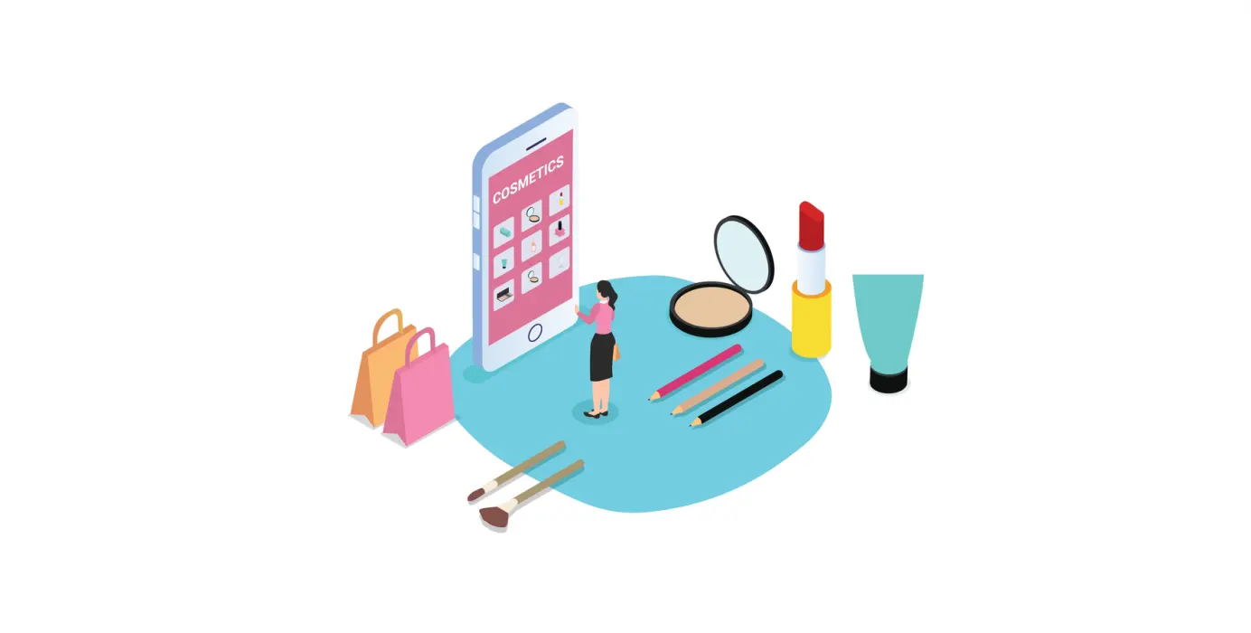
If you’re selling skincare, makeup, or anything beauty-related, your UX for beauty brands needs to work hard. Not just to look good, but to actually help people move from browsing to buying.
If you’re running or designing a beauty website, this blog is for you.
Make navigation feel like second nature
Great e-commerce UX practices start with simple navigation. Categories should be clear, not clever. Instead of guessing whether SPF lives under “skincare,” “summer picks,” or “essentials,” help users get to what they need without friction.
On a good beauty website, filters work fast, menus are clean, and mobile browsing feels just as easy as desktop.
Use photos that do more than just look good
In beauty, visuals sell. But UX for beauty brands means using those visuals with purpose. Show close-ups, real skin, and different lighting. Let people swipe, zoom, and actually see what they’re getting.
Good e-commerce UX practices let visuals do the talking, because on a beauty website, pictures aren’t just pretty, they’re part of the pitch.
Product pages should answer real questions
What does it look like on oily skin? How long does it last? Can I layer it with other products?
Your beauty website should answer those questions clearly on every product page. The best UX for beauty brands uses short descriptions, honest reviews, and FAQ sections that actually help shoppers decide.
Don’t overload pages, just focus on what real buyers care about.
Keep the cart visible and simple
When someone adds an item, your cart shouldn’t vanish or be confused. Show what’s inside, keep totals clear, and make the next step obvious.
A smooth cart experience is one of those quiet ecommerce UX practices that boosts trust especially on mobile, where space is tight and attention spans are shorter.
Make mobile a priority, not an afterthought
Most users visit your beauty website from their mobile device. That means UX for beauty brands must be mobile-first, not just mobile-friendly.
Menus, filters, checkout flows, all of it should feel easy on a small screen.
Don’t shrink your desktop site. Build for how people actually shop.
Conclusion
A great beauty website isn’t just about nice photos. It should actually help people get what they came for. The best ecommerce UX practices make it easy to click around, compare shades, and check out without getting lost. It’s not about doing more, it’s about doing just enough, really well.
No guessing, no clutter. Just a smooth path from “ooh, I like that” to “add to cart.” Smart UX for beauty brands is about showing up right when it matters.
 Previous