What You’ll Learn
- How smart design decisions make banking websites feel safer and simpler
- Why great UX for banking apps can build long-term customer trust
- What makes top-performing finance apps easy to use across devices
Introduction
Let’s face it, when it comes to money, what people really want is clarity.
No one opens a finance app hoping to solve a puzzle. If you’re designing or refining banking websites or working with finance apps, then this blog is for you. We’re going beyond visual polish to look at what really matters: clean layouts, smooth interactions, and experiences that quietly earn users’ trust.
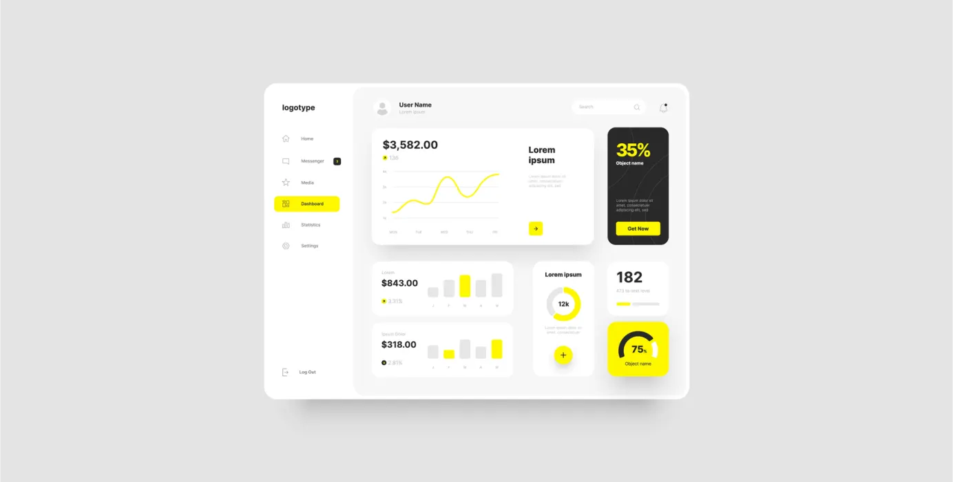
Whether someone’s paying a bill or checking last month’s spending, a strong UX for banking apps keeps things simple. Because in finance, it’s not just about looking good, it’s about feeling in control.
Clarity First, Always
When someone opens a finance app, they’re there with purpose. Good design shouldn’t get in the way. Strip down the clutter. Focus on hierarchy. What needs attention? What can wait? The best banking websites don’t overwhelm with options, they guide.
A crisp, focused interface makes people feel like they know what they’re doing, even if it’s their first time.
In the world of finance apps, clean doesn’t mean cold. It means clear.
Make Navigation a No-Brainer
If a user has to guess where to click next, something’s off. Great UX for banking apps means menus are intuitive, not inventive. Use familiar icons, clear paths, and flows that just make sense. The fewer steps, the smoother the journey.
For banking websites, this might mean a persistent top nav or a well-placed “Pay Now” button. For finance apps, it’s about gesture-friendly interfaces and readable layouts. In both cases, simplicity wins.
Design for Trust, Not Just Looks
Security is a given in finance but it has to feel secure too. Good UX for banking apps communicates safety without shouting. Small touches like “We’ll never share your data” or a simple lock icon can quietly build trust.
People using finance apps aren’t just entering data, they’re handing over their financial life. So whether it’s login flows or transaction screens, banking websites need to look and act the part.
Mobile Matters More Than Ever
These days, people manage money while commuting, queueing, or between meetings. Finance apps must function flawlessly on mobile—not as an afterthought, but as the primary experience.
Even banking websites need to be optimized for smaller screens. Responsive design isn’t optional anymore. The layout, buttons, and flow all need to work without the user zooming in or squinting. Mobile-first UX for banking apps is no longer ahead of the curve but is the baseline.
Give Feedback (The Helpful Kind)
Ever hit “Submit” and wondered if it worked? Yeah, that. A strong UX for banking apps closes that loop. Show users what happened, what’s next, or what went wrong, very clearly.
Finance apps that confirm every step build user confidence. Banking websites that quietly refresh or move on without an update? That just creates anxiety. A good rule: if an action matters, your design should say something about it.
Conclusion
In the finance space, clarity is power. A well-designed experience doesn’t just help users get things done, it makes them feel capable and safe doing it.
From smoother flows to intentional security cues, the best finance apps and banking websites succeed not because they’re flashy, but because they understand real users.
This blog isn’t just a checklist—it’s a new way of thinking about design. If you’re building with trust, speed, and usability in mind, you’re already on the right path.
 Previous